Thursday, February 16, 2017

Social Media Do's and Don'ts

Social Media is the worst thing ever invented. I truly believe social media should not exist, even though I probably open my Instagram app over one hundred times a day. Social media's rooted in pride, being a way for people to brag about the highs in their life, but it just leads to people over editing and over looking life and life experiences. People have become consumed with taking pictures with the sole purpose of posting them, and life experiences have almost become just another photo op. People have begun to miss what's right in front of them because they are so consumed in what other people are doing and one upping other's experiences with their own. 

Best Designed Places/Museums/Architecture/Clubs This

This logo is for The Melt Down, a food truck in Seaside, Florida, that sells nothing but grilled cheese. I think their logo is very playful and creative. I especially love their typeface they chose for their logo and the fact that they decided to include their location (30A) on their logo because 30A is a very popular tourist spot and their logo serves as an advertisement by itself, which is very clever.
This logo is the logo for the North Point Ministries High School Student Ministry, InsideOut. I enjoy this logo because I think the circle logo is interesting and not very obvious towards its purpose.

Music/Band Design and Music


I enjoy the simplicity of this album cover. The darkness of the cover contrasts the calming music of the album, which I think is a very fascinating approach.

Although I am not a big fan of the type of this album, the yellow contrast with the black silhouette is very visually appealing, and this is most likely my favorite album of music of all time, so the visual of the album cover is constantly on my homescreen. Unlike the last cover, this cover very much symbolizes the calm, happy music of the album.
I enjoy the playful, child-like mood of this album cover, which very much symbolizes the music of this album. The typeface of the album name is very 60s and very visually appealing, and although the "Brother Records" logo isn't very appealing, it almost fades into the background.

This is the cover of Jack Johnson's newest album, and it very much resembles the others, including "In Between Dreams" seen above. This cover is very visually appealing due to the type taking up the entire cover and the visual flow of the type around the figure.

Complete this sentence:


"Each week I feel as though I must check in with..."
Each week I feel as though I must check in with God. My creativity stems from the Creator, and my relationship with Him is what inspires me to create. I believe that the Lord puts attributes of Himself in each of His people, which connects us to Him. I enjoy creating, especially painting and writing, and I feel as though my creativity links me to Him and are His fingerprints on me.

Best in t-shirt and fashion design!!PA

Add caption
Add caption
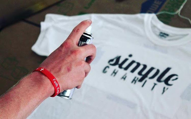
SIMPLE CHARITY!!! These tshirts are hand made by Simple Charity, a student organization that raises money for extreme poverty, using a stencil and bleach or spray paint. I think it. is extremely creative and a form of art due to the fact that the students are hand creating each one and each one turns out a little bit different.
Passion Conference 2017 t-shirt design: I consider this a form of art due to the fact that it is original, and it is more than just typography on a t-shirt.